Flags By Colours
Data visualization experiment using flags of the world
Communication design, Computer programming, Data visualization, Exhibitions, Research
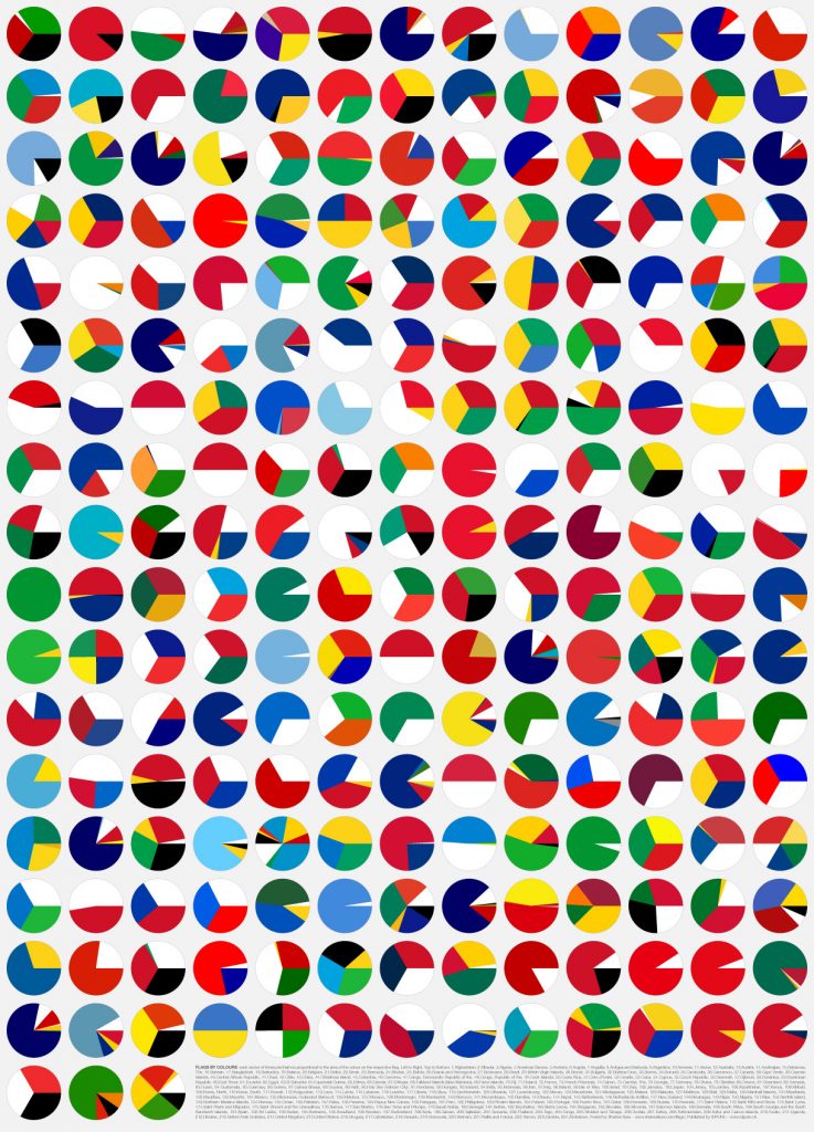
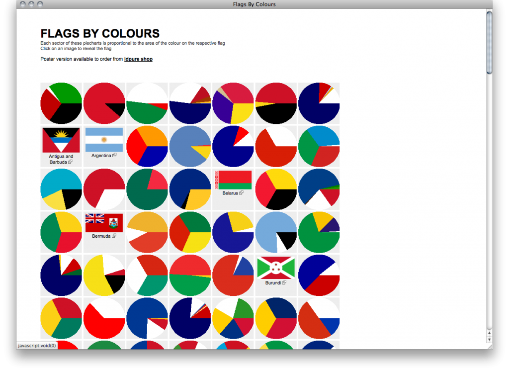
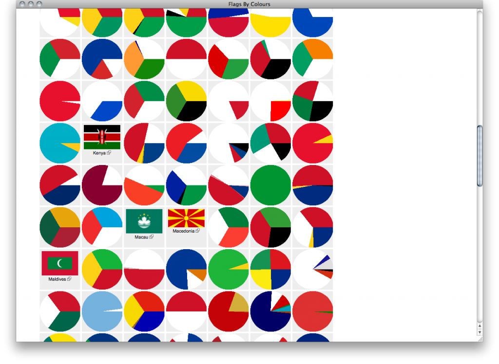
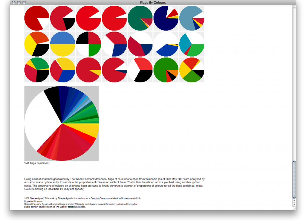
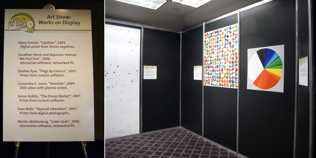
Flags of the world as piecharts. Each sector of these piecharts is proportional to the area of the colour on the respective flag.
Using a list of countries generated by The World Factbook database, flags of countries fetched from Wikipedia are analysed by a custom made python script to calculate the proportions of colours on each of them. That is then translated on to a piechart using another python script. The proportions of colours on all unique flags are used to finally generate a piechart of proportions of colours for all the flags combined.
Link: https://shaheeilyas.com/flags/
A variation of that project: https://shaheeilyas.com/flags/flags_mixed.html
Tags: Communication design, Computer programming, Data visualization, Exhibitions, Research, Art, Generative, Installation, Print, Social, Website
Year: 2007
Exhibitions
- IEEE Visualization 2007 Conference in Sacramento, California. USA, forum for data and information visualization advances for academia, government, and industry. Co-curated by Golan Levin, Fernanda B. Vigas and Ben Fry.
- Filmbase, Dublin, Ireland (2008) as part of “Synth Eastwood Show 5 Flags & Anthems”
Publications or Media Coverage
- Brain Pickings – Color as Data: Visualizing Color Composition
- Data Flow (2008 Die-Gestalten, Germany) Visualising Information in Graphic Design
- IDPURE (N°13, 2007) The Swiss magazine of graphic design and visual creation
- Kelvin – Colour Today (2007 Die-Gestalten, Germany) investigating today’s evolving perception and application of colour
- Gentlemen’s Quarterly – GQ Magazine (May 2008 Italy) on Style | Design section
- Information Aesthetics – Data visualization & visual design
- ColourLovers – Colour & design for creative inspiration